
The essay argues that the attempt to represent ASL in two dimensions is not a new, postmodern phenomenon, but is instead one that is embedded in deaf history at least as far back as the nineteenth century. The essay then provides a close, historically contextual reading of a particular illustration from the October 1928 issue of The Silent Worker, showing evidence of a multivocal imageword; a successful two dimensional representation of ASL, depicted in a clash with the heteroglossic English text with which it appears.
On the whole, American Sign Language seems to resist representation on the two-dimensional plane of the printed page. In her article, "Writing Deaf: Textualizing Deaf Literature," Kristen Harmon says that when Deaf writers use "the conventions of printed English" to convey their ASL work, it "embodies the hearing, not the Deaf, world" (201). Later in the essay she adds that, despite this, "there are Deaf writers who assume that it is possible to restructure the written world," and she gives examples of two post-modern Deaf writers who use "ASL gloss, italics, fingerspelling, traces of interlanguage, and other typographic and syntactic devices" to accomplish this kind of restructuring (205-6). She says that Deaf writers today "are slowly raising a resistant, disruptive, subaltern presence" by "pointing out the slipperiness of meaning, by breaking English, by making over English into hybrid forms, and by demanding that the reader look" (207).
The essay below counters Harmon's argument slightly by showing that this "subaltern" Deaf presence is not a newly emerging, post-colonial or postmodern phenomenon. It will argue that, in fact, the "restructuring" of the notion of "text" was already at work in the early twentieth century (if not before). This will be demonstrated through an explication and contextualization of a two-dimensional, printed image from a 1928 deaf periodical. The essay will show that this is an ASL text, in that it is a dialogical utterance that, while it is "caged" in print, resists its capture by rupturing language. It breaks out from the page just as clearly as a kinetic sign flies through the air.
My academic training, before coming to deaf education and deaf studies, was in nineteenth century American literature (specifically, women's poetry in the periodicals). In 2010, I read Christopher Krentz's Writing Deafness: The Hearing Line, a wonderful conjunction of these two academic interests. In the book, Krentz mentions "The Little Paper Family" (hereafter "LPF"). I had not come across these deaf periodicals in my previous research, and naturally, the idea of a network of such publications piqued my interest. When none of the colleagues I queried (hearing and deaf educators) could tell me much more about the LPF (most of them had never heard of it), I decided to find out more on my own. After reading Tom Harrington's "Brief History of the Little Paper Family" on the Gallaudet University website, I started to explore that site for primary materials. It turns out that only a handful of these papers (at least those from the nineteenth century) have been indexed and digitized by Gallaudet. The one with the most complete run, and perhaps the most well-known of the Little Papers, is The Silent Worker, so I browsed its pages first. 1
Almost immediately, one cover of The Silent Worker, from October of 1928, jumped out at me (fig. 1). I am not the first to spot this unusual illustration; it had been selected years ago for full-page reproduction in Jack R. Gannon's book Deaf Heritage, but it appears there without any commentary or explanation (241). It turns out that this cover was used three times in The Silent Worker, for first time in February 1927, again in February 1928, and then finally in October 1928, the only cover so duplicated. The image does not refer to, nor is it explained by, the contents of any of the three issues. Clearly it was important. But no one has, until now, attempted to comment on it and its possible significance.
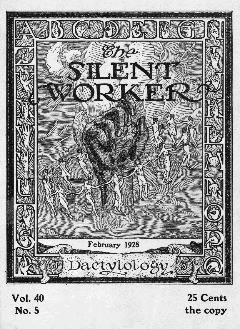
Fig. 1 The cover of The Silent Worker, February 1928, Vol. 40, Issue 5. http://gaislandora.wrlc.org/islandora/object/gaislandora%3A8607#page/1/mode/1up
Audio Description: a full-page black and white etching of a dark hand with index finger slightly extended surrounded by a circle of small figures dressed in togas. The border of the magazine cover is made up of letters and hands, the hands fingerspelling the alphabet. The words "The Silent Worker" appear directly above the central hand. The word "dactylology" appears on a scroll at the bottom, below the date. It reads "25 cents the copy" on the lower right corner.
I found, and still find, this image to be astonishing. In all of my experience with American periodicals, I've never come across anything like it. And my first thought on seeing it was this: what is that hand in the middle saying? I knew that this was an ASL text—that this was an imageword—but it took time, research, and perspective to figure out what it was saying to me. This essay is the result of that process of inquiry.
What is an imageword? It is a term borrowed from visual literacy scholar Kristie Fleckenstein's book, Embodied Literacies:Imageword and a Poetics of Teaching, and it is quite useful to use when talking about ASL texts. In her larger discussion of our current need for a multimodal literacy, Fleckenstein uses the term to talk about multimodal morphemes, or the idea that "image and word are always melded in meaning" (5). She points out that categorizing "text" and "image" as separate types of signifiers is a false binary, with "text," or word, too often occupying a position of privilege. The binary is false, she says, because even a word printed on a page — the black thorns that comprise each symbol of the alphabet — "is an image, as is the space within which it is ensconced" (5). In other words, she suggests that images and words should be viewed as co-existent — words are images — images are words. In semiotic terms, they can be equal "vehicles" of meaning:
…these…logics join in recursive feedback and feed forward loops so complex that we cannot determine where one stops and another begins…neither image nor word exists without the other…infused with double logics..image and word are mutually constitutive, mutually creative, hence "imageword"…we cannot name the world without imagining the world, but we cannot imagine the world without naming it (30-1).
To paraphrase, there is no "either/or;" picture and word may exist simultaneously, and one cannot exist without the other. Imageword is a gestalt that oscillates between sum and parts, kind of like an optical illusion (fig. 2).
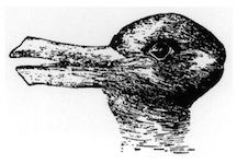
Fig. 2. "Kaninchen und Ente" ("Rabbit and Duck") from the 23 October 1892 issue of Fliegende Blätter
Audio Description: black and white etching of an optical illusion that, when viewed one way looks like a duck and when viewed another way, looks like a rabbit.
Since imageword represents the idea that an image and a word may coexist, acting equally as signifying vehicles, it may serve as a more accurate way to talk about ASL, a language in which image and word are fused, and for which there must always be an "interpretant." 2
Just as image and word cannot exist without the other, so imageword as a historically situated utterance can only be formed in relationship to Otherness (other people, others' words and expressions, all situated within lived cultural worlds in time and place). It is therefore advisable to extricate imagewords from the tapestry of their historical context, viewing them as threads "embedded in a history of expressions by others in a chain of ongoing cultural and political moments." As we know from the work of M. M. Bakhtin, New Historicists, and other critics, the result of uncovering the context of an imageword can reveal heretofore hidden dynamics of "linguistic and social struggle" (Irvine http://faculty.georgetown.edu/irvinem/theory/Bakhtin-MainTheory.html).
This essay posits that the hand of The Silent Worker is an early ASL text, that it is an imageword, that it is disruptive, and that, as such, it speaks of a linguistic, historical, and social struggle. In short, the hand both signs and signifies this struggle. These ideas will become evident in a detailed examination of this imageword's medium of production, its cover, its title, its border, the elements that surround it within the composition, and the context that surrounds it, historically.
The Production of the Hand: Periodical printing in the nineteenth-century United States
The striking covers of The Silent Worker hand were the result of a century-long evolution of both the "deaf press" and of periodical publication in the United States in general. At the beginning of the nineteenth century, only about thirteen magazines with a circulation of about one thousand each existed in the United States. As is well documented by scholars Jack Gannon, John Vickrey Van Cleve, Susan Burch, and R. R. Edwards, among others, the story of the "silent," or "deaf press," had similar modest beginnings in 1836, starting with the Canajoharie Radii (site of the Central New York Asylum for the Deaf and Dumb), a paper printed by Levi S. Backus for both deaf and hearing readers. The success of this publication led faculty at the American Asylum for the Deaf (Hartford) to start a paper at the school, which later became The American Annals of the Deaf in 1847. The Deaf Mute, out of the North Carolina School for the Deaf set up shop soon after, in 1849 (Gannon 238-250, Edwards 111-13).
After the Civil War, the mainstream periodical press began to boom, with more than 3,500 publications being circulated by the end of the century (Hutchinson 8). Likewise, after mid-century, the success of The Annals and The Deaf Mute snowballed; there were more and more papers made by and for the deaf. There were independent newspapers, such as The National Exponent out of Chicago and the National Deaf Mute Gazette out of Boston, but perhaps more significant were the weekly and monthly papers produced by deaf institutes from Louisiana to Kansas (and in Canada as well). At its height, this network, dubbed "The Little Paper Family" in the 1890s, boasted at least fifty papers (Gannon 247, Van Cleve PTO 98). The Silent Worker, published at the New Jersey School for the Deaf in Trenton, was the shining star of the Little Papers, with unstinting, professional production values and a large circulation (Burch 31-49, Gannon 238-253, Buchanan in Van Cleve, Deaf History 172, et. al.).
The proliferation of both the Little Papers and mainstream periodicals was due to an increased rate of literacy as well as a developing sense of a cohesive cultural identity, but it was also largely the result of new printing technologies and distribution methods. At the start of the century, for example, "an experienced pressman could [only] produce between 200 and 300 sheets per hour. Each operation was performed by hand, from inking the plate to stacking the sheets. By the close of the 19th century, presses were delivering 100,000 complete newspapers in an hour" (Hutchinson 8). The steep increase in production was largely due to the introduction of half tone reproduction technology, cylinder rotary printing presses, and the linotype machine in the late 1800s (which, by the 1930s, became the dominant type of press used in the US publishing industry).
Deaf people have always been on the forefront of new communication technologies, and the nineteenth century was no different; just about every deaf school in the country had professional-grade linotype machines and presses as well a well- trained printing department that could handle all aspects of the printing process, as is evident from this description of the New Jersey school's print shop in 1917:
…a much larger camera was purchased and in addition thereto a buzz-saw for cutting copper and trimming blocks, a beveler and the necessary chemicals for wet-plate making, the same as is used in all commercial shops. These improvements greatly facilitated the work of this department and also provided a means whereby boys could command high wages when they left school…Next all three more linotypes will be added, making a battery of 6 machines, besides a Miller-Saw trimmer and a power stapling machine. (Porter 107)
The modernization and equipping of The Silent Worker was largely due to the work of the man who reported on these acquisitions, George S. Porter (whose name will appear again several times later in this essay). A master printer who joined the New Jersey School for the Deaf in 1892 as a teacher, Porter later became head of the print department. Once there, he was able to gain financial support from New Jersey school board patrons, allowing the shop to get the commercial presses that enabled sophisticated printing and pictorial layouts that rivaled those of the local papers. Porter also expanded the staff of writers and correspondents to the national and even international level (Gannon 240, Buchanan in Van Cleve DHU 174-5).
The Periodical Cover
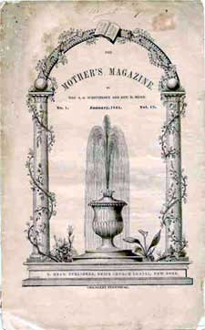
Fig. 3. Mother's Magazine 1844: Example of an early periodical cover (Grow).
Audio Description: small reproduction of old periodical cover dated 1844. Shows a fountain flanked by two ivied pillars, surmounted by an arch with a book at its apex.
For the most part, early U.S. periodical covers mimicked the frontispieces of books, and were sparingly illustrated, partly due to the expense and constraints of print technology (fig. 3). Similarly, early issues of LPF papers had minimal embellishments, but interestingly, as Beth Haller notes, these were always visually significant and almost always alluded to "the visual nature of the deaf language and culture" (5). The Arkansas Optic, for example, featured a drawing of a large eye (5). 3 The Canajoharie Radii and Mute Journal of Nebraska had banners in both English and the manual alphabet (figs 4,5).
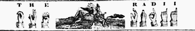
Fig. 4. Fingerspelled banner with seated figure reading (center). The Canajoharie Radii Canajoharie Library and Art Gallery. http://www.mvls.info/lhg/canajo/12.html
Auditory Description: Words THE and RADII with illustrated fingerspelled letters underneath appear to right and left of central image of what appears to be a person reading. (Image reproduction is poor).
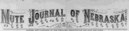
Fig. 5. English and fingerspelled letters on banner of Mute Journal of Nebraska Vol. 5 No. 7, http://gaislandora.wrlc.org/islandora/object/mutejournal%3A3.
Auditory Description: Large, elaborate letters of masthead with curlicue embellishments are fingerspelled by small illustrations of manual alphabet beneath.
The nameplates (and later covers) of The Silent Worker, as well as journals like the Oregon Outlook, depicted detailed scenes of students at work setting type and rolling the press, or contained other references to text, like books or scrolls (figs 6-9).
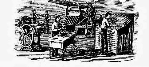
Fig. 6. Students setting type. Detail from masthead of The Silent Worker, used from 1888 to 1890.
Auditory Description: black and white etched illustration of two printing presses, one to the left and one in the center. A person in the middle stands at a composing table, arranging type, a person to the right stands at a type case, placing letters onto a composing stick. Two smaller figures stand to the left in the background, seemingly checking a finished run.
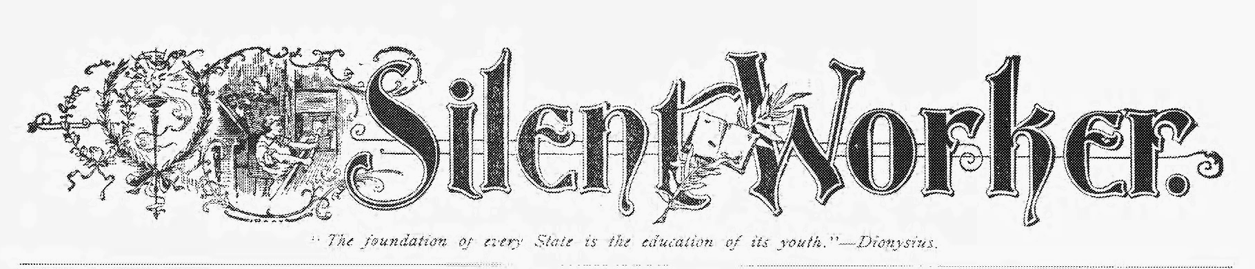
Fig. 7. Student pulling a print. Masthead of The Silent Worker, used from 1890s to 1919.
Auditory Description: The words Silent Worker appear in large ornate font. The "S" is preceded by an elaborate design of vines. Within the vines is a small picture of a male working what looks to be a screw press. Beneath the masthead is the motto: "The foundation of every State is the education of its youth." — Dionysius.
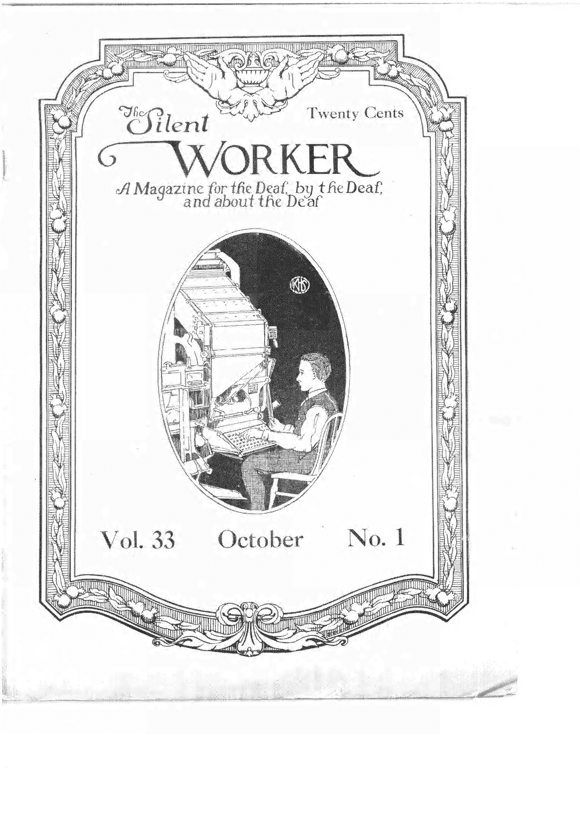
Fig. 8. Student setting type using a "line-casting," or linotype machine. "Poster" cover from The Silent Worker, October 1920.
Auditory Description: Full page cover with art deco border of leaves and flowers. At the very top are a pair of hands poised as bird's wings. Below, the words "The Silent Worker: A Magazine for the Deaf, by the Deaf, and about the Deaf." Underneath this, in the center of the cover is a black and white illustration of a male typing at a linotype press. The initials KHS can be seen in a small circle within the central image.
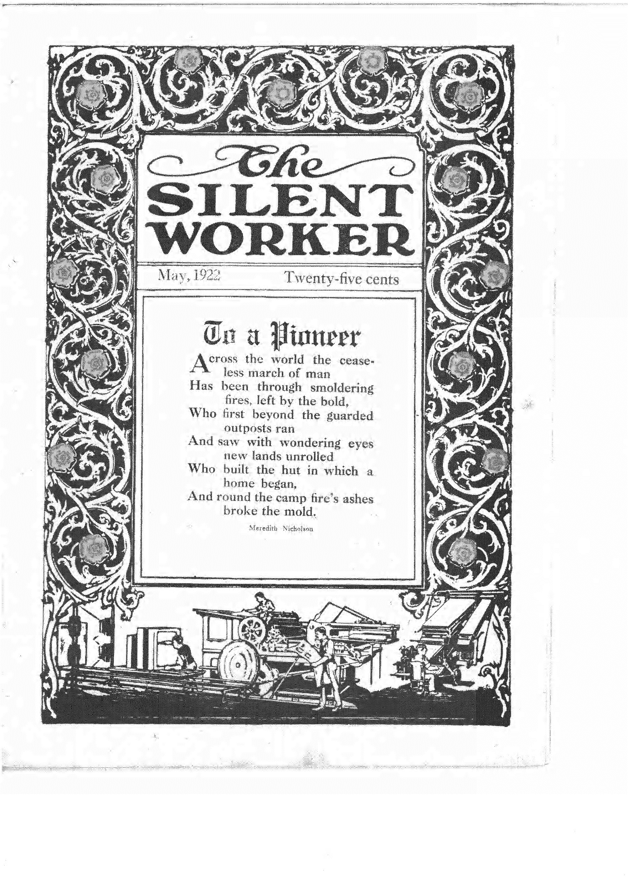
Fig. 9 Various stages of the printing process (bottom margin). Cover from The Silent Worker May, 1922.
Auditory Description: Full page black and white cover with very elaborate Celtic interlace border on top and right and left margins. The words "The Silent Worker" appear then the date and price "twenty-five cents." Below this, in the center, is a poem "To a Pioneer." At the bottom of the image is a small illustration of various stages of the printing process, from the type case on the left, to a large rolling printer in the center, to a linotype machine on the right side with tiny people operating each machine.
Improved technology eventually led to an ability to print more intricate illustrations in the periodicals, and as a result, cover illustration became a solid profession by the late 1800s. Illustrators, not photographers, still dominated graphic design, even though the technology for photogravure photographic reproductions had been in existence for a long time (Grow 2). From the 1890s on, then, larger illustrations, called "poster covers" (usually a four-color lithograph or steel-cut engraving in an Art-Deco style), appeared on the fronts of American magazines (fig. 10).

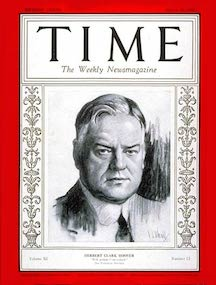
Fig. 10. Magazine covers from 1928: Celestrial July Fortune and 1928 Time Magazine cover of Herbert Hoover in the "poster cover" style.
Auditory Description: The Fortune cover is a four-color lithograph depicting a comet going through the sky above an observatory. The black and white Time Magazine cover illustration has a drawing of Herbert Hoover in the center, flanked on two sides by a decorative margin. A margin of red surrounds the entire edge of the cover.
These types of poster covers appeared in some LPF papers, but The Silent Worker in particular followed the trend, starting in 1920 (figs. 11-13).
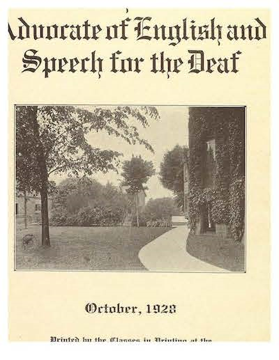
Fig. 11. Rochester Advocate Rochester School for the Deaf, October 1928.

Fig. 12. The Pelican Baton Rouge, LA. February 1949
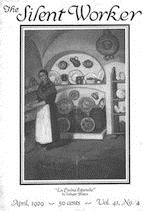
Fig. 13. The Silent Worker April 1929 41:4.
Auditory Description: The words "Advocate of English and Speech for the Deaf" appear over a photograph of the RSD campus with October 1928 underneath. The Pelican is a full page cover of a cabin amid trees and hills rendered in very expressive lino-cut black and white, with only the words "The Pelican" at the top and February 1949 at the bottom. The Silent Worker image from 1929 is a full page lithograph of "La Cocina Espanola" showing a woman standing in a kitchen area with plates and crockery displayed against an adobe wall. The date and volume information appear below.
The three covers of the hand of The Silent Worker are full-page "poster covers," standard at the time, but, unlike the majority of mainstream covers, and unlike most other poster covers printed by The Little Papers, these covers were created using black and white drawings, likely reproduced on the press using a linoleum block-cut method. 4 Besides being a technique hardly ever seen in the Little Papers (The Pelican, fig. 12, is the only other example I found), it was also rarely used at The Silent Worker; only four other such block print covers were ever made (figs. 14-17 below). (One further lino illustration, the PSA for paying attention to traffic signs — appears inside the paper in 1924 (fig. 18)).
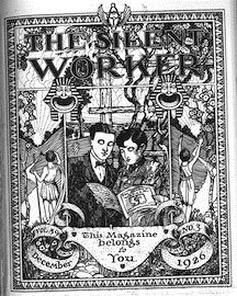
Fig. 14. The Silent Worker cover, showing two Deaf readers of TSW. "This Magazine Belongs to You." December 1926 39:3
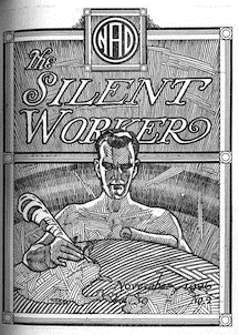
Fig. 15. The Silent Worker November 1927 cover, showing a man creating a world map, his pen on Washington, D. C., symbolizing the global reach of N.A.D.?
Auditory Description: Figure 14 is a heavily illustrated black and white cover, with a couple dressed in 20s clothing reading a copy of the Silent Worker in the center of the image. On either side are figures in togas, backs turned, looking off into the distance. There is an Egyptian motif with the borders of the image, and the words "This Magazine Belongs to You" are inscribed on a scroll at the bottom, with the date and issue. Figure 15 is a black and white etching with the letters NAD in a circle above the title The Silent Worker. Below is a man with a quill and a scroll who appears to be drawing a world map. The tip of his quill touches "Washington, D.C."
Fig. 16 The Silent Worker cover, July 1924 cover advertising an upcoming NFSD meeting.
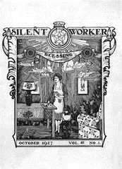
Fig. 17 The Silent Worker 40:1 October 1927, showing a mother writing a letter.
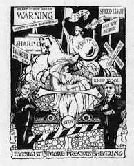
Fig. 18 The Silent Worker July 1924, Public Service Announcement for heeding traffic signs
Auditory Description: Figure 16 is a black and white image with the words The Silent Worker on the top, with NFSD St Paul 1924 beneath. There is a farmer with a team of horses on the bottom and a celestial city amid clouds, emitting beams of light emanating from the center of the image. Figure 17 is a black and white lino cut showing a woman in what seems to be the living room of her house, writing and reading a letter. There are clouds and the word "Blessing" hanging on a banner beneath the title "The Silent Worker." Figure 18 is a crowded black and white illustration showing a variety of traffic signs: "Danger," "Warning," "Speed Limit," a figure on a horse bearing a shield that says "Safety First" is flanked by two gentlemen in dark suits making what seem to be the signs for "More" and "Help." A possibly female figure in the center shields her eyes as if looking into the distance. On the bottom of the cover, on a scroll are the words "Eyesight is more Precious than Hearing," aimed presumably at deaf people driving or crossing streets.
The illustrations above (except for fig. 16) were created by a mysterious "J. H. S." whose initials ("J.S.") can be seen on the bottom of the "hand" cover (fig. 1). For a long time I supposed that this was the work of a student artist, but George Porter, in one of his editor's notes, reveals that "the front covers are…all in pen and ink…by artist J. H. Stauffer of Hazelton, Pennsylvania" (TSW December 1926). 5
There is an important final element in regard to poster covers in general: taken as a genre, these covers hardly ever "relate[d] to a story inside the magazine. Rather the poster cover depicted a season or conveyed a general mood" (Grow 241, italics mine). This is certainly the case with The Silent Worker cover/s we are about to examine; nothing on them seem to relate to any stories or articles inside, but they definitely convey a "mood."
The Nameplate
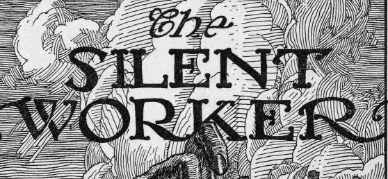
Fig. 19. Detail from The Silent Worker cover February 1928, showing masthead.
While atypical in terms of being rendered through lino-cut reproduction, the Silent Worker cover is a typical poster cover in that there are no "cover lines," that is, there are no lines of text on the cover image, teasing the prospective reader with allusions to the contents or articles to be found within. Instead, the central typographical element is the nameplate, or masthead, which is rendered in a solid black (and likely handmade) font (fig. 19). The letters are set on a background of swirling clouds rendered by the sharp, expressionistic gouges of the v-cutter used to incise the linoleum block.
The titles of many mainstream nineteenth century periodicals were delightfully idiosyncratic: The Cherokee Rose Bud, Ladies Weekly Museum, Time and the Hour, Daily Eastern Argus, Southern Workman, Atoka Vindicator, etc.. The LPF paper titles were even better: The Deaf Mute, The Deaf Mute Pelican, The Little Cracker (out of Georgia), The Deaf Mute Cyclone, The Voice, The Echo, The Inner Ear, the Rochester Advocate, and the Deaf Mute Casket. 6 But the title "Silent Worker" perhaps has a more nuanced meaning than the rest.
According to LPF scholars, the main goal of the papers, from their inception, was to "support the further expansion of academic and vocational instruction for deaf children," and to "influence the character and values." To that end, the papers often "gave advice on how to succeed in a hearing world" (Edwards 112-13). They emphasized independence as well as good behavior. But the papers (and the schools that housed them, for that matter) had also been created with the purpose of creating employable workers — silent workers — deaf people who could become "proficient workers and independent citizens" (Buchanan in Van Cleve Deaf History 175). Schools (perhaps more accurately school boards) felt that since the state provided vocational and academic training, students were obligated to use this training to become "exemplary employees who would serve as informal representatives of all deaf persons" (176).
When in 1888 The Deaf-Mute Times changed to "The Silent Worker," the editors explained in the September issue that "[The title] indicates quite aptly what we wish each of our pupils to become." Even the paper's motto, inscribed under the banner, was a saying from Dionysius: "The foundation of every State is the education of its youth" (also inscribed on the Library of Congress). George Porter himself later expressed the wish to develop in children "a full sense of the dignity of labor" (Buchanan 176 ). Porter and other editors like him, in order to achieve this goal, managed to make their print shops vital parts of the deaf schools, because, as Porter points out, they "provid a means" for making a living (an excellent means, it turns out - by 1880, deaf printers could earn up to thirty dollars a week) (Edwards 120). The papers and the shops provided an invaluable vocational training ground for students learning a trade that would employ deaf workers well into the twentieth century — a trade that, indeed, became a "traditional" deaf occupation (Christiansen 260-1).
But the title "Silent Worker" represents more than the desire of the school boards and faculty of deaf schools to generate pliant classes of citizen-workers, an aim they shared with American educators in general. According to the 1888 editor of The Silent Worker, "while our new name would imply that we are to go about silently in our work, we will, as heretofore, be as loud-mouthed and fearless in the defense of the deaf as ever, and our enemies had better stand from under." It is clear that from the beginning, The Silent Worker took a decidedly political stance; the paper wasn't meant to be a mere factory, stamping out passive workers with no voice, no "say," and no power; it was to serve as an active, "fearless" mouthpiece—almost a weapon—"in the defense of the deaf," against the "enemies" of the deaf (TSW February 1888). One could use one's hands to work, and one could also use those hands to have a "loud-mouthed" voice, on paper and in sign.
The Silent Worker continued in this political vein, even decades later. In subscription advertisements from the 1920s, the journal's editors declare the paper to be, with the support of the National Association of the Deaf (NAD), a "powerful Deaf voice" "national in scope" and "national in utility," committed to working out a "square deal" for the deaf. The use of the words "square deal," an echo of Theodore Roosevelt's progressive domestic policy of the early 1900s, clearly announces The Silent Worker's position of advocacy in the struggle of the deaf worker in American society. So great was this affiliation with labor that when the paper was revived in the 1940s, the name was changed to The Deaf American, possibly to avoid confusion with the Communist publication, The Daily Worker.
It is clear, from the very images on the covers of the Little Papers, to the history of their production, that for almost 100 years, a very large proportion of deaf labor was vitally connected to the physical creation and production of texts. Deaf hands were intimately familiar with the handling of paper, the placement of type, with the creation of and inscribing of images onto steel and linoleum plates, with the inking of plates, with the continuous, rolling production and reproduction of images and words. Because of the hands of deaf writers, illustrators, and printers, Deaf images and words were shared on a national scale. The labor, the production of the hand, the hand of the "silent worker," resulted in reams of text — millions of words and images, in English, a language not entirely their own —a language with which, historically, they had an ongoing, fraught relationship.
On the Border, In the Margins
 "
"
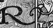
Fig. 20. Detail from The Silent Worker February 1928 cover showing the "R" in "worker" intertwining with the border letters "J" and "K."
The layered significance of the words in the masthead is intertwined, both literally and figuratively, with the border of the cover. The first and last letters in the third word of the title, "Worker," with "W" on the left and "R" on the right (fig. 20), connect with this border, which runs along the four margins of the cover, framing the inner image. The border is comprised of letters of the English alphabet in white, outlined in black, each with a depiction of the corresponding letter of the signed alphabet placed either behind, in front of, or interposed into each English grapheme (fig. 21).
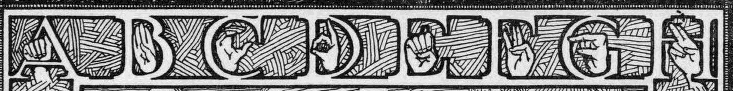
Fig. 21. Top border of The Silent Worker February 1928 cover showing the letters and handshapes for the letters A through H.
The letters seem to be designed to look like pieces of a typeface. Trained to use letterpress or linotype machines, deaf printers would have handled English characters as material objects daily—they would have molded type, handled it, arranged it into words on composing sticks, bundled the words onto the forms that lay on top of the press beds, typed it on keyboards, and checked matrices. They would, however, likely never have seen letters shaped quite like this, incorporating what was, to them, a more familiar, manual alphabet.
The margin of The Silent Worker image could be seen as just a neat visual element in the overall Art Deco design of a poster cover, but I suggest that it can also be read as a literally "marginalized" linguistic border, or contact zone. Marie Louise Pratt, in "Arts of the Contact Zone," defines such zones as "social spaces where cultures meet, clash, and grapple with each other, often in contexts of highly asymmetrical relations of power, such as colonialism, slavery, or their aftermaths" (34). Linguistic contact zones, where languages "meet, clash, and grapple," often result in a hybridization of the contact languages (the "interlanguage" mentioned by Harmon), and this is what we see happening here in the margin of The Silent Worker image. In the course of spelling out the manual alphabet, the hands and English letters become tangled up— there seems to be a kind of interaction, if not struggle, going on. Going back to the idea of imagewords, I propose that these are imageletters, meaning letters and images occupy the same space simultaneously.
This margin mirrors what was happening throughout American deaf education in the late nineteenth century. Then, as now, schools for the deaf were rich contact zones; according to R. R. Edwards, students often came to the schools with their own "natural," or "home" signs, and when they came into contact with teachers and other students who used "cultivated sign," they underwent a "process of creolization," in which variations of "the sign language," as well as English were combined (38). However, this was also a time when there was a marked shift from "translational approaches […] to a study of dactylology" (Supalla 99). Fingerspelling, seen as "an absolute solution to pedagogical problems," was used heavily in the classroom, as a way to educate students by trying to make some deaf communication "like English print as much as possible" (Supalla 99, Musselman 11). Fingerspelling was also seen as a way to bridge the gap between deaf and hearing worlds; hearing teachers actively encouraged hearing people to learn fingerspelling (as opposed to sign) ostensibly "in order to bring deaf people more tightly into common society" (Edwards 39, 44).
Overall, though, as Ted Supalla notes, "researchers and native signers have viewed the use of the manual alphabet […] as the intrusion of English on the natural language" (99). Fingerspelling can therefore be seen as a site both of tenuous connection and of conflict; a contact zone, a bridge and a margin; all of which are represented in The Silent Worker imageword, as English letters attempt to intertwine with the manual letters in the margins of the plane of discourse.
The "Word": Dactylology
Fig. 22. Detail from the bottom of The Silent Worker cover, February 1928 showing the word "Dactylology" inscribed on a scroll. The letters "J" and "S" appear to each side, and the date, February 1928 appear immediately above.
As the imageletters run alphabetically and clockwise, moving and spelling their way from the upper left corner around the margins, they are interrupted on the bottom of the page by the word "Dactylology" (fig. 22.). It is the only word in English to appear, aside from the titular "The Silent Worker" and the words "February" and "October" respectively.
Great pains are made to emphasize the material textuality of this word; it is inscribed on a paper scroll in cursive font, and is grandly unfurled in a prominent position beneath the date of the issue. This scroll, which was also used on two other "J.H.S." illustrations (figs 14 and 18), is reminiscent of the "devise," or "motto" that appears on heraldic coats of arms: a "word or sentence of special significance to the bearer usually placed on a scroll either below an achievement of arms or above the crest" (OED). The word "Motto" is derived from the Latin muttum, and from the Italian word motto, which means 'word' (OED). Are we to think that "dactylology," or fingerspelling, comprises "the word" or "motto" of this issue of The Silent Worker? 7
"Dactylology," as it turns out,is sort of a "cover line," but only for the first appearance of the cover in February 1927 8 Otherwise,, the word appears to be just a reference back to the activity that is taking place both in the central image and along the border of the image. It reads as a label, an emphatic inscription of an English "motto," or "word," that interrupts the visual flow of the fingerspelling. This further reinforces the idea of the border as linguistic boundary or contact point between English and ASL, where two languages come into contact, wrestle, and here, collide.
The Dancers
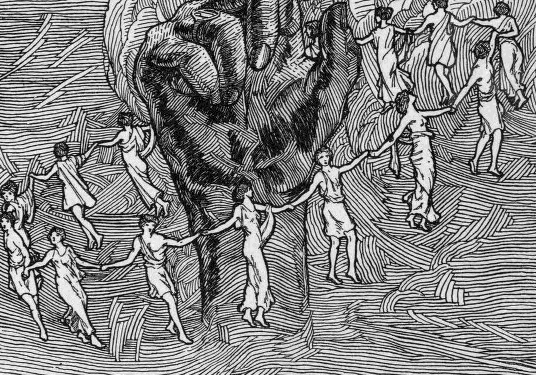
Fig. 23. Detail from The Silent Worker cover February 1928 showing the circle of white dancing figures in a circle around a dark hand.
We are getting closer to approaching the central image in the cover, the dark hand, but first, what do we make of the circle of fourteen (visible) togata that surround it? They are not muses, because they do not number nine, and they alternate, male and female. They hang in mid air, forming a circle amid a dynamic, cloud-filled, wind-tossed sky; there is, despite the heavily etched, black lines of the lino-cut, a sense of swirling motion (fig. 23). 9
They seem to be dancers caught, like figures on a Keatsian urn, in the act of forever moving from left to right, round and round the hand. In response to my queries about the image, Connie Godoy Perry, a deaf student, said, in response to my Facebook query: "The dancers make me think of the way the hand dances through the ASL alphabet A-Z. In fingerspelling, the tempo, defined movements and order of the letters determine understanding — just as in dance" (Perry). This allusion to dance, a kinetic, fully embodied activity, could be a further attempt by the artist to evoke a sense of motion in a two-dimensional frame. All of this potential motion is deliberately designed to conjure a sense of the embodied, three-dimensional motion and active space of ASL on the "flat land" of the page. 10
It has been suggested that these figures are specifically engaged in a maypole dance. This is a reasonable assumption, since this was still a commonplace ritual in nineteenth and early twentieth century America and Britain, enacted on many college campuses and at community festivals in general, and it was an especially well-known and cherished tradition at the deaf institutes as well, serving to symbolize and instantiate communal unity. Scholars consider the maypole a symbol of the axis mundi, and the dance a seasonal celebration of the cyclical return of spring, light and life. Perhaps, like many poster covers, this is a celebration of the season (Johnson and Prijatel in Hutchinson, 241). But the two months in which this The Silent Worker cover was issued were February and October, neither of which fit the idea of this being a springtime celebration. It is interesting to note, though, that May Day was, in the late 19th century, designated as "International Worker's Day." The United States celebrates this as Labor Day, in September. Perhaps the cover is "convey(ing) a general mood" of celebration, not for the arrival of spring, but for the worker — specifically, the silent worker (241).
The Hand of The Silent Worker
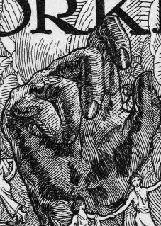
Fig. 24. The central hand, detail from February 1928 cover of The Silent Worker.
The central design element, and possibly the most fascinating part of the entire The Silent Worker cover images from 1927-8, is the dark, disembodied hand that rises from a lake into the air, like a monolithic, Easter Island totem (as one of my colleagues, Ira J. Rothenberg said, "it's like a sculpture, more artistic than linguistic"). 11 If the imageletters and "motto" on the border of the piece connote a contact zone, a conjunction of English words and signed images, what are we to make of this central hand?
Early in the process of trying to decipher what the hand imageword was saying, I consulted many people. One of them was ASL poet, Kenny Lerner, whom I'd consider an ASL expert. Like many of my other colleagues (hearing and deaf), he said he had no idea what it was. I had more success when I posted the image on Facebook (on the ASL THAT group wall) and asked if any of my deaf friends or colleagues there had an idea of what the hand might be saying.
Some people suggested that the hand was signing "g." Several others suggested that it was making the "x" type hand shape used to sign "celebration," a gloss on the maypole dance that surrounds it. One suggestion was that the hand and dance are all meant to celebrate "Deaf editor's George Porter's reinstatement as editor[…]which [is] mentioned in the October issue," which was to me a very plausible interpretation, at first.
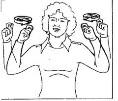
Fig. 25. ASL sign for "celebrate." stock image.
Indeed, the story of what happened to George Porter is one of the keys to the mystery of the hand, and, as told by Robert Buchanan, it is a compelling tale. Sadly, it is also a common story, one that may be told of more than one deaf editor of a Little Paper. 12 Briefly: in 1917, Alvin E. Pope was appointed superintendent of the New Jersey School for the Deaf. Pope, while not the first supporter of oralist pedagogy at the school, was the first superintendent to espouse exclusive oral instruction and the outright banning of sign language there. As Buchanan relates, writers at The Silent Worker argued against this and instead recommended continued use of the "combined system," one that used "natural and cultivated signs, dactylology, writing, pictures, props," etc., depending on the needs of the students, with an emphasis on the use of sign language (Supalla 145). The paper and its editors, like members of the LPF, had a history of supporting this approach, during what in Deaf history have been called the "Communication Wars" of the late nineteenth century (Buchanan 184-5, Burch 31-49, Edwards "Conclusion").
In 1921, Pope demanded that Porter, as managing editor, oversee the elimination of any critiques of his oralist efforts at the school, and of oralism in general, for that matter. Despite this edict, the critique in the paper, though "indirect," continued (Buchanan 186). When, in September of 1928, Pope published a report in the Annals ("The Scientific Spirit") that made his oralism quite plain (to an insulting degree); tension between him and Porter grew to the point that Pope finally asked Porter, before the start of the school year, to retire a year earlier than intended. Porter refused, hired a lawyer, and was eventually granted a one-year extension, but in the meantime was replaced as head of the print shop. In spring of 1929, Pope fired five more deaf teachers who challenged him, and by the end of the school year, there were no deaf teachers left at the school. In a final act of retaliation, Pope ended the publication of The Silent Worker altogether, effectively silencing any Deaf opposition. His claim was that the paper was too expensive to produce, and that it was distracting the print instructors and disrupting the students. The death of the paper was met with mourning. As contributing writer and photographer Alexander Pach said, "no tribute can express our grief" (Buchanan188).
While the story is mentioned by Pope, albeit in very polite terms, inside the October issue, the postponement of the editor's retirement was a hollow victory, at best, and doesn't really seem to be an occasion for celebration. But beyond that, the problem with connecting a "celebrating" cover to Porter's story is that this image was first issued in February, a year earlier (1927).
In addition to the problems relating to the date of the cover, the notion that the hand is making the sign for "celebration" doesn't quite work either. As can be seen in Figure 25, the sign generally requires the use of both hands. And, while the handshape for "celebration/celebrate," a kind of "x," resembles that of The Silent Worker hand, it isn't quite the same (the fingers in "celebrate" are more firmly closed in the production of that sign than that rendered in the image).
This still leaves us with the question "what is the hand saying?" Following the logic of the composition as a whole, the hand in the center should be signing the ASL sign for "fingerspelling." The one descriptive English word on the cover is "dactylology;" the hands on the border, moving clockwise, depict the movement of dactylology—they are engaged in the act of doing it; the dancers, too, seem to mimic the movements of fingers, moving, spelling. But this idea doesn't work, either. The ASL sign for the word "fingerspelling" involves several movements, both of hand moving laterally and of the fingers moving up and down in a "typing" movement (fig. 26). This is near-impossible to capture in a still image, and even an attempt to do so does not in any way resemble the hand in The Silent Worker image (fig. 24).
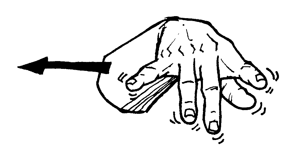
Fig. 26 ASL sign for "fingerspell." Stock image.
The hand of The Silent Worker, then, does not appear to have any direct relationship to any of the English text on the page or beneath the page. If it is not trying to say something about fingerspelling, or celebrating/not-celebrating retirement, etc., what is it saying?
I believe that the hand is making the ASL sign for "word." Not "dactylology," the English term for words spelled out in English, but "word" in the ASL sense of word. This is difficult to see at first. For one thing, the hand hangs in isolation mid-air, cut off from a body, cut off from a face, both of which are needed to lend full expression to an ASL sign. Also, given the theme of "dactylology" that overruns the rest of the image, the expectation is that the hand is also making a letter. A quick look around the border shows that this isn't the case. But look at this description: "make "C" with right hand but close rest of fingers." This is from a 1918 sign language dictionary, describing the hand shape required for signing "word" (Long). This most closely resembles what The Silent Worker hand is doing.
The definition says that the "rest of fingers" are closed. The fingers in the image are not closed. That is, I believe, because the hand is showing a sign in the process of becoming; the sign is just beginning to be formed; the fingers are being caught as they start their closing movement. The hand is in motion just as the clouds and the dancers are in motion. This idea of a sign-in-process was shared by several of my deaf colleagues on the aforementioned Facebook site when they were asked about the hand:
Ellie Alarcon: "I see it as a hand in motion, about to become an "A" or a "T."
Connie Godoy Perry "This is a beautiful cover. I first thought the hand showed the letter "x," but mostly view it as the hand just before it forms into signs."
Diane Plassey Gutierrez: "It could be a neutral hand shape. In a relaxed position, it is raised as if to begin fingerspelling" (Alarcon, Perry, Gutierrez, italics mine)
Another reason why it is hard to see the hand signing "word" is because the index finger classifier, CL:1 (fig. 27), which is often used in ASL to represent a person (fig. 28), and which is normally used to complete the sign for "word," (fig. 29) is seemingly not there.

Fig. 27. CL:1 Illustration of hand with index finger extended. Stock image.
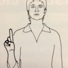
Fig. 28 Drawing of ASL sign for "person walking by." Stock image.

Fig. 29. Photograph of ASL sign for "word." Stock image.
But it is there. Instead of moving horizontally toward another hand as in Fig. 29, the "g" or "c" of the hand in The Silent Worker image moves forward. The unfolding "c" is foreshortened, facing the reader. It is poised to keep moving forward, toward the "fourth wall," toward the page, toward the surface of the cover. That page is all that lies between the sign and the reader. The reader therefore becomes the CL:1 classifier. The hand is about to go right through the fourth wall, to the reader, as it must, in order to complete the sign. The ASL sign, the "real" "word" for the deaf reader, doesn't need the page like "dactylology" does; it breaks the page; as Kristen Harmon says, it "breaks English."
As M. M. Bahktin posits in Speech Genres, "the first and foremost criterion for the finalization of an utterance…is the possibility of responding to it" (76). In this case, the utterance, or sign for "word," being incomplete as it is, creates that "possibility." It has "addressivity" (adresovannost) — it is "directed to someone" (95). It awaits a response. In order to be a complete ASL sign, the hand must reach through the page to the eye of the reader (CL:1). The sign will only be complete and successfully interpreted when it meets the eye of one who is fluent in ASL (the deaf reader). It is that reader who completes the utterance, by fully ascertaining its nuanced meaning. To break the fourth wall — to rupture the text — is to reach deaf eyes, and therefore complete the utterance. "This Magazine Belongs to You."
But why? Why print something that looks like an homage to fingerspelling but is really a powerfully rendered sign for "word," an imageword that can really only be quickly deciphered by a deaf reader? It's clear: the central hand is being, as the editor of the magazine said in 1888, "loud-mouthed and fearless in the defense of the deaf.". It is speaking to while at the same time embodying the struggle between oralism and sign language. It is the struggle that was taking place between the pages of the magazine, in its offices, in the halls of the New Jersey School for the Deaf, and across the entire country. The hand, to some eyes "celebrating," or just doing some more fingerspelling, is actually raised in an act of defiance. Even though sign is being banned from the school, even though the paper is being shut down (literally being "folded"), even though the hand is a disembodied one, it still rises; it still signs, coming right at you with the "word." Like an upraised "Deaf Power" fist, it refuses the "combined system;" it refuses "dactylology;" it refuses English words; it is powerfully poised to represent the sign for word, entire — in ASL. And so, in effect, the hand has "the last word."
Conclusion
It is clear that the imageword of this magazine cover, with its layers of history and associations, enacts the "diglossic" polyphony of utterance. Bakhtin said that the word is, "at every moment of its linguistic life…opposed to the realities of heteroglossia" always "breaking through to its own meaning and its own expression across an environment full of alien words and variously evaluating accents, harmonizing with some of the elements in this environment and striking a dissonance with others." The hand truly is a silent worker, and it works to "break through to its own meaning," while both harmoniz[ing] with and caus[ing] dissonance with other "alien…[English] words" (Discourse 270, 277 italics mine). As Harmon says, "it does not valorize or covet agency made available in that [English] language but instead begins to break it apart on the page, begins to see even the word, the layout on the page, as a mode of resistance" (207, italics mine).
The imagewords on these Silent Worker covers enact the push/pull of language, embodying the tensions between English and ASL. If the history of language is a struggle between the monologic and the dialogic, then this Silent Worker cover, with its imageword hand, clearly depicts a historical, ongoing interplay between English word and ASL sign; the struggle in American culture between ASL and oralism. This is apparent from just reading the surface of the page; it is further proven by the historical context that lies beneath the page.
The hand of The Silent Worker also enacts Fleckenstein's feedback loop between is and is as logic. In rupturing the surface, it "demands that the reader look," pointing at the marked dissonance between what a hand can say/sign and what a word printed at the bottom of a page says or signifies. In this way The Silent Worker cover oscillates, like the rabbit-duck, between the printed word (what Bakhtin calls "something given [dan]"), and the hand, as a living, moving sign in the process of enacting its own meaning ("the posited [zadan])"; it performs the concept behind the word "dactylology," "finger discourse," word-making, as defined by a Deaf user of signed language, not a hearing user (DN 270). The hand as imageword exists in both in concord and in conflict with the word printed beneath it, as it demonstrates that ASL is not merely mimetic, spelling out English words letter by letter; it is a different language; it embodies a complete discourse.
Also, the hand of The Silent Worker expands how we may now view the history of ASL literature; it is no longer limited to just one mode, either print or live performance. It can exist in many permutations at once. This hundred year old hand does exactly what Harmon says modern deaf writers are just now trying to do: it "slowly rais[es] a resistant, disruptive, subaltern presence" and it "commandeer[s] written English and insist[s] on our status as a bilingual, bicultural people living in a diglossic subculture" (207). There is room for much more research into the role of images such as this throughout nineteenth century deaf history. And, as the hand moves toward us to break the frame, breaking free from the bonds and boundaries of the "flatlands" of two dimensional text, it moves us toward H-Dirksen L. Bauman's notion that ASL imageword, rather than merely deriving from a traditional poetics, seems to be the next logical extension of it; that is to say that all of us are now circling back to a predominantly visual culture, a culture of signs (157).
In the end, the hand of The Silent Worker embodies all that is involved in the naming of things—the various ways in which the production of words and signs allows us to mediate and internalize events around us. The image, the word, the sign, they are that which flies from "out there" toward us, into the eyes, into the mind, and into the heart. My colleague, Cynthia Roberson, perhaps said it best when she read the hand of The Silent Worker. What it said to her was "The Power and the Beauty of our hand to communicate."
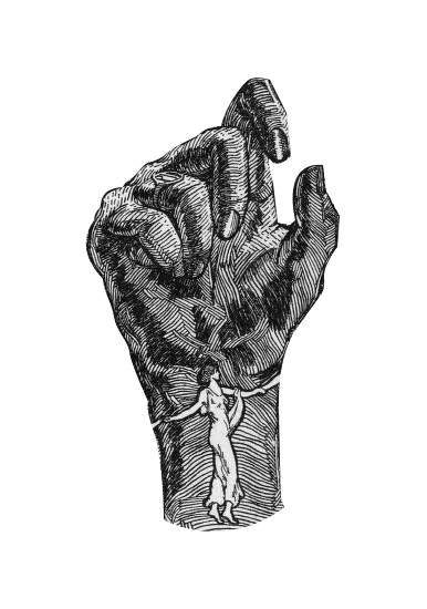
Fig. 30 Auditory Description: Final image of the hand, excised from the background of the cover.
Works Cited
- Alarcon, Ellie. "ASL THAT post." Facebook. 19 June 2015. Bakhtin, Mikhail Mikhailovich. "Discourse and the Novel." Michael Holquist ed. The Dialogic Imagination: Four Essays by M.M. Bakhtin. Austin: U Texas P, 1992.
- _____. Caryl Emerson, Michael Holquist, Vern McGee, eds. Speech Genres and Other Late Essays. Austin: U Texas P, 1986.
- Bauman, H. Dirksen L. American Sign Language as a medium for poetry: a comparative poetics of sign, speech and writing in 20th century American poetry. Thesis Binghamton: SUNY, 1998.
- Burch, Susan. Signs of Resistance: American Deaf Cultural History 1900-World War II. New York: New York UP, 2002.
- Christiansen, John, "Deaf People and the World of Work" in Deaf Way II, Carol Erting, et al., eds. Washington, DC: Gallaudet UP, 1994.
- "dactylology." OED Online. June 2004. Oxford University Press. 30 April 2007 <http://www.oed.com/view/Entry/46811?redirectedFrom=dactylology#eid>.
- Edwards, R. R. Words Made Flesh: Nineteenth-Century Deaf Education and the Growth of Deaf Culture. New York: NYU P, 2014.
- Fleckenstein, Kristie. "Introduction." Embodied Literacies: Imageword and the Poetics of Teaching. Carbondale: SIU P, 2003.
- Gannon, Jack. Deaf Heritage. Maryland: National Association of the Deaf, 1981.
- Grow, Gerald. "Magazine Covers and Cover Lines: An Illustrated History" Journal of Magazine & New Media Research. Vol. 5, No. 1, Fall 2002. 2.
- Grushkin, Don. "ASL THAT post." Facebook. 19 June 2015.
- Gutierrez, Diane Plassey. "ASL THAT post." Facebook. 22 June 2015.
- Haller, Beth. "The Little Papers: newspapers at the nineteenth-century schools for deaf persons." Journalism History 19.2 (1993): 43-50.
- Harmon, Kristen. "Writing Deaf: Textualizing Deaf Literature." Sign Language Studies: Winter 2007; 7, 2; ProQuest pg. 200. 7 March 2016.
- Harrington, Tom. "Brief History of the Little Paper Family." LibGuides. http://libguides.gallaudet.edu/content.php?pid=128460 Update 2010.
- Hutchinson, Peter. "A Publisher's History of American Magazines — Magazine Growth in the Nineteenth Century." <http://www.themagazinist.com/uploads/Part_1_Population_and_Literacy.pdf. Accessed 6 March 2016.
- Irvine, Martin. "M. M. Bakhtin: Main Theories." A Student's Guide. Web 2004-2012 <http://www9.georgetown.edu/faculty/irvinem/theory/bakhtin-maintheory.html.>
- Long, J. Schuyler. The Sign Language: A Manual of Signs. Des Moines: Robert Henderson, 1918. 36.
- Musselman, Carol. "How Do Deaf Children who Can't Hear Learn to Read an Alphabetic Script?" Journal of Deaf Studies, 5:2 Winter (2000), 9-31.
- Padden, Carol A. and Darline Clark Gunsauls. "How the Alphabet Came to be Used in a Sign Language." Sign Language Studies. 4.1 Fall 2003, pp 10-35.
- Perry Connie Godoy. "ASL THAT post." Facebook. 20 June 2015.
- Pope, Alvin E. "The Scientific Spirit and the Education of the Deaf." American Annals of the Deaf 73:4 (1928). 312.
- Porter, George S. The Silent Worker. 41.1 October 1928. Gallaudet University Library Deaf Collections and Archives.
- Pratt, Mary Louise. "The Arts of the Contact Zone." Profession 1991. MLAP, 27-40.
- Rothenberg, Ira J. "ASL THAT post." Facebook. 19 June 2015.
- Supalla, Ted and Patricia Clark. Sign Language Archeology: Understanding the Historical Roots of American Sign Language. Washington, D.C.: Gallaudet UP, 2015. pp. 97-128, 145.
- Van Cleve, John V. and Barry A. Crouch. A Place of Their Own: Creating the Deaf Community in America. Washington, D.C.: Gallaudet UP, 1989.
- ——. Deaf History Unveiled: Interpretations from the New Scholarship. Washington, D.C.: Gallaudet UP, 1999.
- ——."Little Paper Family," in Gallaudet Encyclopedia of Deaf People and Deafness. New York: McGraw Hill, 1987.
Endnotes
-
Jean Bergey's piece, "Little Paper Family." History Through Deaf Eyes, on the Gallaudet website is an invaluable source of information on the Little Paper Family. In the process of writing this essay, it became very apparent to me that more of an effort needs to be put forth in collecting, preserving and archiving the Little Family Papers (and any other material related to Deaf history). Materials from all of the deaf schools in the U.S. need to be preserved and recorded properly before we lose pieces (literal pieces) of Deaf heritage.
Return to Text -
These ideas are likely familiar to anyone conversant in semiotics. See Pierce. C. S., The Essential Pierce. Vol 2. Bloomington: Indiana UP, as well as the work done by Heidi Rose, especially "A Semiotic Analysis of Artistic ASL and a Performance of Poetry" in Text and Performance Quarterly 12 146-159.
Return to Text -
"The nameplates for the papers were designed to draw a reader's eye. The North Carolina school's early nameplate was adorned with angels, encircling a drawing of the school. The newspaper names reflected their geographic locations, such as the Hawkeye in Council Bluffs, Iowa; Deaf-Mute Pelican of Baton Rouge, Louisiana; or the Silent Hoosier of Indianapolis, Indiana, and their association with deafness by use of terms like silent, deaf-mute, and sign. They showed the visual nature of the deaf language and culture with names like the Arkansas school's newspaper, the Optic. It featured a drawing of a large eye in the name plate" (Haller 5).
Return to Text -
The lino-cut, first used in early twentieth century Germany as a poor-man's substitute for wood-cut printing, was not in common use, gaining wider acceptance only after artists Pablo Picasso and Henri Matisse popularized it as a technique. I know that this was the technique used because George Porter writes in one editor's note: "It is refreshing to note the increase in number of the l.p.f. that come to our desk with handsomely embellished front page covers, the result of linoleum block cutting. Some are really artistic and show how closely related are the art and printing departments to one another" (The Silent Worker, February 1928).
Return to Text -
I was long determined to find out the identity of "JS" aka "JHS," the creator of most of the drawings for the lino-cut SW covers. Convinced he or she must have been a student at Trenton, I tried (in vain) to find lists of attending students from 1928 (contacting the Katzenberg School as well as the New Jersey Historical Society, among others, without success). Finally, George Porter, in a small squib, identified JHS — "We are indebted," he said, "to Mr. Stauffer for these excellent contributions, which were offered to us gratuitously. While he has made our covers attractive, we hope he will gain by the publicity it gives him, for his work has been highly prized by artists who are competent to judge" (TSW December 1926). I was unable to find any further information on Mr. Stauffer, though I was able to locate possible relatives (Jacob Stauffer, (1808-1880) a lawyer, naturalist, printer, lithographer, and photographer). I was also able to identify "KHS," who illustrated the cover in Fig 16. among others, as Kelly H. Stevens, who taught art at New Jersey School for the Deaf until 1929, then worked for one and a half years at the Trenton School of Industrial Arts. He went on to have a very long and successful career as a teacher and an artist. (https://www.gallaudet.edu/library-deaf-collections-and- archives/collections/manuscript-collection/mss-036.html)
Return to Text -
Casket: a small ornamental box or chest for holding jewels, letters, or other valuable objects. In the nineteenth century, the word didn't have a morbid connotation; it was often used in the titles of periodicals, meaning that the paper was a container for valuable letters, thoughts, and ideas.
Return to Text -
As pointed out earlier, one motto of the paper was the quotation from Dionysius. Another, a later motto (visible in fig. 8) was "A Magazine for the Deaf, by the Deaf, and about the Deaf." The word "dactylology," a now-archaic term for the manual alphabet, first appeared in Thomas Blount's dictionary Glossographia (1665) in which it is defined as "finger discourse," or "finger-speech": the art of "speaking" or communicating ideas by signs made with the fingers. The word later appears in George Dalgarno's 1680 Didascalocophus, or The deaf and dumb man's tutor, and is defined as "cheirology," or "interpretation by the transient motions of the fingers." Fingerspelling itself can be traced back to alphabetic signs used in Europe from at least the early 15th century. The alphabet, first described completely by Spanish monks, was adopted and expanded upon by the Abbe l'Epee in his Institution Nationale des Sourds-Muets a Paris in the 1700s. In 1860, about fifty years before the SW cover, the word was still in common usage, appearing in The Guardian to describe a ceremony "performed in the finger language, or, as it is grandiloquently termed, dactylology." (OED, Padden).
Return to Text -
Inside the February, 1927 issue, pages 134-5, is an article entitled "Is it English or is it Not: A Newspaper Controversy over the Manual Alphabet." Here there are five "letters" or responses to a statement made by Lillie R. Ernst, then superintendent of the St. Louis School for the Deaf, who supported the teaching of fingerspelling as well as lip reading. She is quoted as saying "Fingerspelling is not English. It is the sign language." Several others, Carl B. Smith in particular, disagreed with Ernst. Dr. Herbert E. Day, superintendent of the Missouri School said: "Fingerspelling is known as dactylology. It is not the sign language. It is simply finger writing" (135). This tension between languages is clearly reflected, as I argue, in the imagery of the cover illustration.
Return to Text -
The artist, J. H. Stauffer, uses two similar togata figures earlier in December of 1926. On the "This Magazine Belongs to You," cover, two readers are positioned in the center, and on each side of them, a man and a woman, dressed in togas, backs turned to the reader, look up at and seem to worship a rising sun (fig. 14.)
Return to Text -
For a brilliant (and imageword) discussion of two-dimensionality and language, as well as a reference to Edwin A. Abbot's 1884 novel Flatlands, see Sousanis, Nick. Unflattening Cambridge: Harvard UP, 2015. 22-27.
Return to Text -
The darkness of the hand was a feature noticed by several of the colleagues I queried, and it raises interesting questions about representation: John Buchanan makes specific note of the dearth of diversity in The Silent Worker in terms of both race and gender in his chapter in Deaf History Unveiled (pp 178-9). All in all, however, I think that the hand is rendered darker just for tonal, compositional reasons — but the questions it calls to mind are good ones.
Return to Text -
See Van Cleve A Place of Their Own, for the story of how, in 1911, the president of the Nebraska Association of the Deaf, J. W. Sowell, who was very vocal in his anti-oralism stance in the Nebraska Journal, was silenced by Frank Booth. The hearing son of one of the founders of NAD, and a staunch oralist, Booth was named superintendent of the Nebraska school. In order to keep his job, Sowell "refused to take any stand" against oralism after that (103-05). This is how the Porter debacle was reported in The Silent Worker (by Chief Editor Pope): "The Committee for the School for the Deaf had decided to recommend Mr. Porter's retirement to the Board of Education which is in line of its policy to retire all teachers after serving thirty-five years and reaching the age of 62. Because of the short notice given Mr. Porter the Board at its meeting on September 8th voted to reconsider the decision of the Committee, so Mr. Porter will return as Editor and Business Manager of "The Silent Worker," for one year only. Mr. Frank Siddall has been appointed at the head of the printing department but will have nothing to do with the "Silent Worker". As to the future of this magazine it is not within the province of the Editor to make a prediction at this time."
Return to Text
